Optimizing Text in Microsoft Word
Font Formatting
When choosing fonts for your documents, you should keep in mind the needs of those who have visual impairments. Here are a couple of easy tips to follow:
- Choose clean, readable fonts, and avoid intricate fonts that are hard to read
- Use a sufficiently readable font size (10 pt or more is recommended)
- Ensure that your text clearly contrasts the page or background color. (If you printed your document in black and white, would there be enough contrast?)
- Avoid using images to deliver text content
Headings
When most authors create text documents they instinctively build a visual hierarchy using font formatting. By utilizing a variety of font families, weights, styles, sizes, colors, and lines, document creators are able to guide the eyes of sighted readers in a way that helps them to progress through a document. Those readers who can see are able to simply glance at a page and identify the relationship of individual sections of content. But what about people who cannot see? All of that formatting is lost when the text is read aloud to someone using an assistive technology like a screen reader, and therefore the relationship between headings, paragraphs, and even whole sections of text can become uncertain unless the author has designed their document to be accessible. When document headings are tagged correctly, assistive technologies can provide valuable information that helps visually impaired users navigate a document. This makes accessible headings particularly important, because their presence or absence affects the readability of the document structure as a whole.
Tagging text as a heading
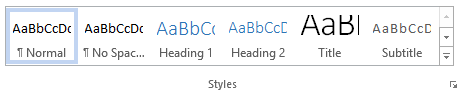
In order for a heading to be considered accessible it has to have more than just unique visual formatting. It has to be tagged as a heading. In Microsoft Word, tagging can be done using the Styles menu on the Home tab.
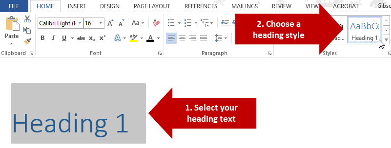
To use this menu, simply select the text that you want to tag as a heading, and then select the appropriate heading level in the styles preview menu (shown below).
How to apply headings level 3 or higher
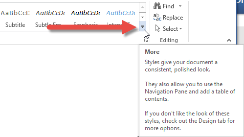
By default the styles menu only includes pre-defined styles for Heading 1 and Heading 2. However, you can utilize more levels if needed. To do this, select the text that you would like to tag and then click on the More arrow button in the Styles menu, and then select Apply Styles.
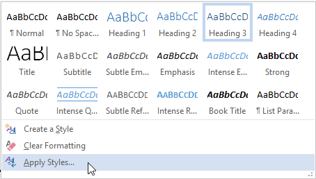
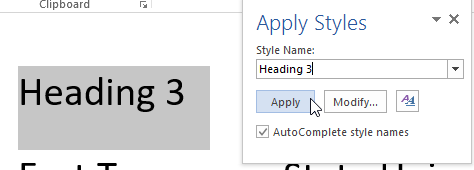
This will open up a small panel menu that will allow you to use a wide range of styles not shown in the styles tab menu. In order to use other heading levels, you can simply type the name of the style into the search box (e.g. Heading 3) and then click Apply.
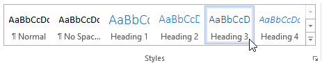
Once you have applied an additional heading level using the Apply Styles menu it will then appear as an option in the Styles menu in the Home tab.
Properly structured heading levels
Heading levels are used to indicate the hierarchy of content sections. The heading levels start at 1 and descend hierarchically with each successive number (2, 3, etc.). Therefore, Heading 1 is the top-most level, and would be appropriate for things like chapter or major section titles. Heading 2, and everything under it, would fall under Heading 1, and so on.
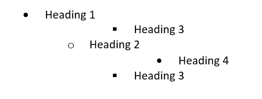
When using multiple heading levels in your document hierarchy, you need to be sure to descend through levels incrementally, without skipping levels along the way simply for the sake of aesthetics. If you skip through levels then you will create a document with unorganized heading tags that will not comply with accessibility standards. To illustrate this concept, it may be helpful to think of headings as being in a nested list. The list below illustrates an improper hierarchy that arbitrarily skips around between levels.
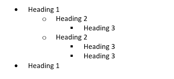
You can understand how a structure like the one above would be confusing. In order to avoid such confusion, you instead need to organize heading levels in a way that makes sense, as in the example below.
Properly Tagged Lists
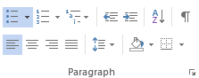
When creating bulleted or numbered lists, ensure that they are properly tagged by using either the bulleted or numbered list button in the Paragraph tool group on the Home page. Doing so will ensure that screen readers properly identify list content.
Meaningful links
Document authors will often include URLs in their documents to point readers to files or pages on the Internet. However, including full URLs can frustrate users who rely on screen readers, because they are forced to listen to the entire URL being spelled out character by character. For example, a URL like https://www.etsu.edu/ would be real aloud as Link: H-T-T-P colon forward slash forward slash W-W-W dot E-T-S-U dot E-D-U forward slash. This is not the most convenient way to be led to the ETSU home page.
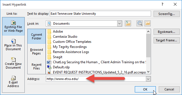
Rather than spelling out URLs, hyperlinks should instead be embedded within meaningful text which describes where the link goes. For example, if you want someone to visit the ETSU home page then you could simply hyperlink some text that says "visit the ETSU homepage." This provides the link while also describing where the link goes.
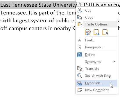
To create an embedded hyperlink, just select the text you want to add a link to, and then right click the selected text and choose Hyperlink from the context menu.